First Draft: Save-the-Dates
It’s sad, but I think Brian is doing much better at accomplishing his wedding tasks than I am. And he’s off defending freedom in Iraq. Turns out I’m a failure not only as a future wife, but also as an American.
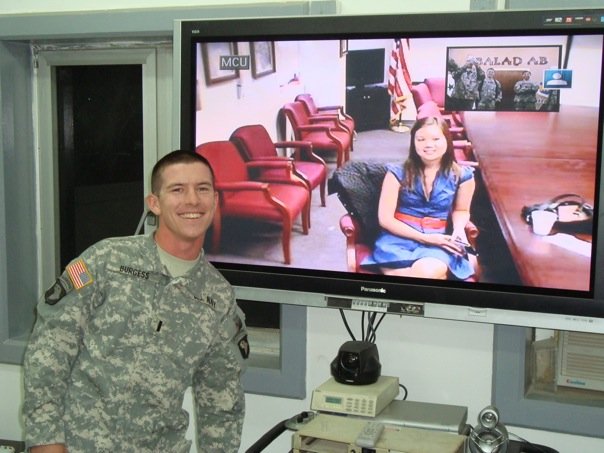
[Side note: He just got promoted to the rank of Lieutenant JG in the Navy! I got to see the teleconference of the ceremony via the military version of a webcam. Look, there we are together. Just like a particularly bad episode of Lonelygirl15.]
Anyway, back to Brian kicking my ass at wedding stuff. Bri, being the graphic design guru that he is, will be designing all the print materials for our wedding– save-the-date cards, invitations, place cards, ceremony programs, CD covers, score cards for the reception dance-off. We looked for a good quote or poem or song lyric to set the theme for everything, but that proved harder than we’d thought. Apparently, there’s a ton of icky “Love is patient, love is kind” crap out there.
I finally found a quote we both liked and could translate well visually– “Love doesn’t make the world go round. Love is what makes the ride worthwhile.” (Lisa, I’m pretty sure you want to make a “My other ride is your mom” comment, so go right ahead.) Kind of a fun, carnival-like theme– minus the clowns. By the way, some Web sites attribute that quote to Elizabeth Barrett Browning and some to Franklin P. Jones… anyone know the truth?
Here are Brian’s works in progress (click for bigger versions):
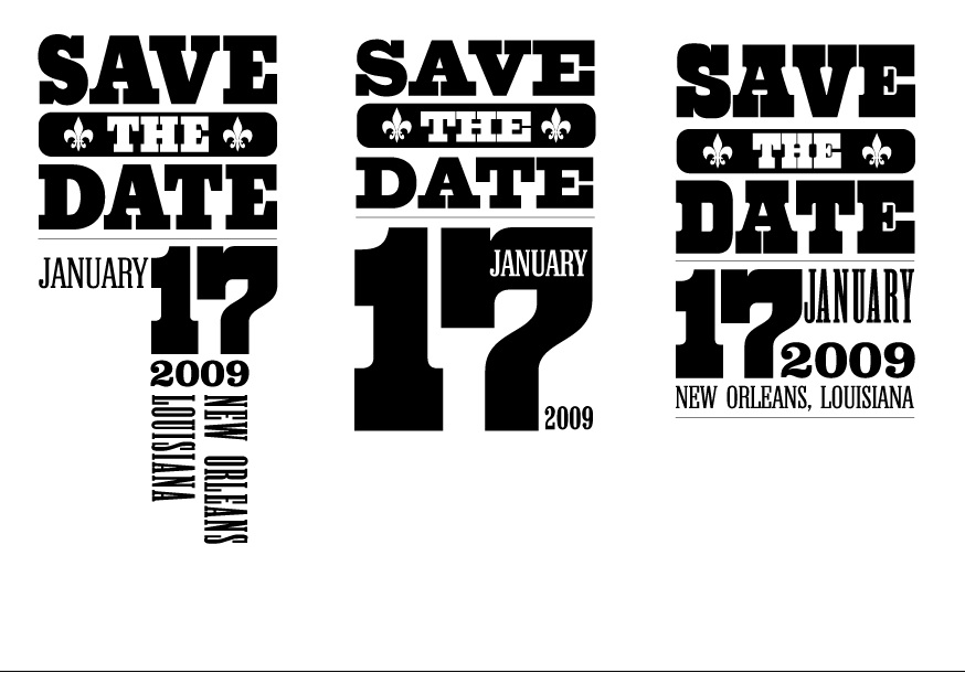
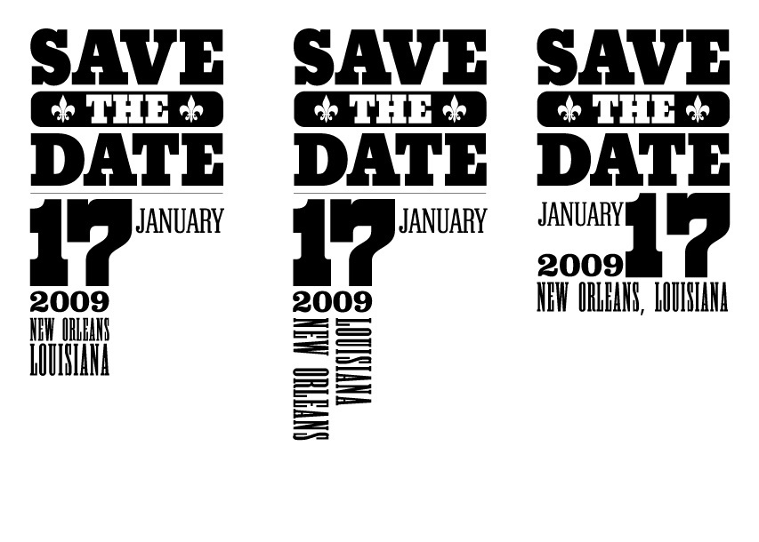
Colors, names and other fun stuff will come later. So… favorites? Which elements do you like the best? Feel free to mix and match.

9 comments
[…] It’s sad, but I think Brian is doing much better at accomplishing his wedding tasks than I am. And he’s off defending freedom in Iraq. Turns out I’m a failure not only as a future wife, but also as an American. [Side note: He just got promoted to the rank of Lieutenant JG in the Navy! I got to see the teleconference of the ceremony via the military version of a webcam. Look, there we are together. Just like a particularly bad episode of Lonelygirl15.] Anyway, back to Brian kicking my ass at Source: http://no-dowry.com/?p=40 […]
[…] So I can’t seem to get my last photo to upload, but Gill has it posted here. […]
I like the one on the top right the best, because it has no white space and I think it’s easiest to read. The one on the bottom left is good, too. Are you going to stick a photo or something on there, too, or are they gonna be text only?
I too like the one on the top right the best. The vertical text out of the top left makes the graphic draag…out…..
You look so patriotic in your photo! :)
Katie Ide, are we twins separated at birth? I was going to make an almost identical comment about design #3. Get out of my head, woman!
Gill and Bri, getting two Type A perfectionist votes for #3 is like getting four votes from normal people.
I vote top right as well.
Have to say, a little dissapointed you said “without clowns” though.
I agree with Ide and Melia; top right design is my favorite. As for possible wedding themes, how can you go wrong with “Whiskey for my men and beer for my horses”? It would be your dream wedding, a Toby Keith wedding!
I was totally prepared for a lecture on the artistic relevance of white space. Thanks for backing up my OCD-fueled opinion.
Oh, and Melia is right. Our votes are gold.
I don’t know if I like Ide and Melia tag-teaming. It’s creepy– like seeing double. Bri and I both do like the bottom half of the one on the top right. But we’re trying to decide between the typeface on the top half– either the top right or middle.
Haha, I thought Darren would have schooled you on negative space! I did like the bottom half of the bottom left one– white space can be good! And there are gonna be other things on here– like our names or something. Probably no images, though.
Chuck, Toby Keith is actually performing LIVE at our reception.